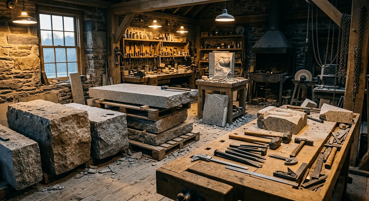
Dynasty Stone Art
Stone memorials & masonry · Sydney
WEBSITE REDESIGN · 2026
THE PROBLEM
Their Google Maps pointed
to the London Eye.
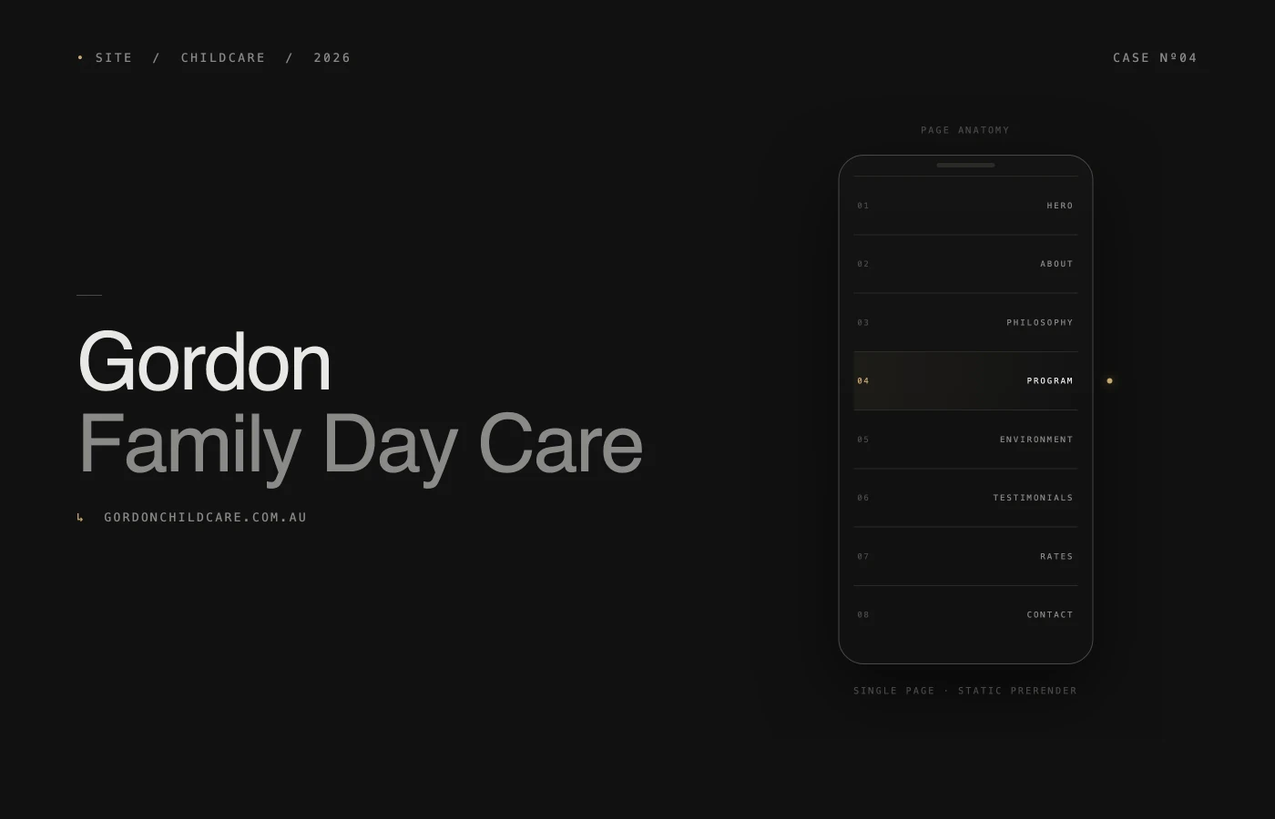
A Sydney-based stone memorial specialist with 23 years of excellence, 190+ project photos, and 7 cultural communities served — and a website that actively worked against them. Only 4 of 14 pages indexed by Google. Zero testimonials in an industry built entirely on trust.
THE APPROACH
A storefront that worked against the work.
We started inside the site they already had.
Fourteen pages, four indexed, photos scattered, the map pin in London. Before drawing anything, we made the mess legible — a live interactive audit the client could click through, not a PDF to sit on a shelf.
THE RESULT
From scattered chaos to clear hierarchy. A bilingual design system. Dedicated cultural landing pages turning their multicultural positioning from a hidden strength into a visible competitive moat. Positioned not as "a good stonemason" but as Australia's multicultural memorial specialist.
“Very professional.”
A five-generation stonemason business relaunching their digital storefront after more than two decades of quietly doing the work. We designed and built a bilingual marketing site (English + 中文), delivered an interactive audit and palette explorer during discovery, and ship it on Sydney-edge hosting with monitoring and care built in. The site reads as crafted as the stone does — considered in its materials, measured in its tone.
OUTCOMES
Live, fast, and bilingual
from day one.
The site is live and still evolving with the business. Early signals from shipping and from the discovery artifacts:
Lighthouse 98+ across Performance, Accessibility, Best Practices, and SEO.
Green on every page — LCP, CLS, and INP all inside Google's thresholds.
Sydney-edge hosting with TLS 1.3 and HTTP/3. Fast for local visitors, quiet to operate.
Bilingual content structure (English + 中文) serving their core Sydney communities directly.
Interactive audit and palette explorer delivered before design — the client could interrogate the direction, not just receive it.
ONGOING
Launch was a checkpoint,
not a goodbye.
Dynasty Stone Art is a live engagement, not a closed case file. We stay on under a care retainer — hosting, monitoring, accessibility checks, and content updates — and the site continues to grow as new cultural landing pages, testimonials, and project photography come online.
The interactive audit and palette explorer remain available to the client as living references, not frozen deliverables. When new communities or product lines come into scope, we revisit the colour system, typography, and information architecture in the same tools we used on day one — rather than starting a fresh PDF cycle. The next phase is structured review data, project-level case pages, and richer cultural content, each shipped in small, visible increments.